Microcomponents
In the cmsassets/_ng/templates/templates.tpl.html there are all microcomponents that can be used across section type JSON settings. Every field in any section has a type property and has its reflection of some microcomponent ID.
Example
If you want to add an input field in a section, the type should be input and it is the input microcomponent from cmsassets/_ng/templates/templates.tpl.html.
In this example (of the section JSON settings), the type is input...
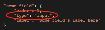
...and it means that it uses the input microcomponent from cmsassets/_ng/templates/templates.tpl.html file. The microcomponent name has a following scheme in the HTML file: component-<NAME OF MICROCOMPONENT>
Default microcomponents:
input
It is a text-only field, perfect to be used for headlines or other one-line text areas on website.
Preview:

JSON configuration example
"some_field": {"order": 1,"type": "input","label": "Some field's label here"}
Example of implementation in a section
@if (!empty($components->some_field))<h1>{{ $components->some_field }}</h1>@endif
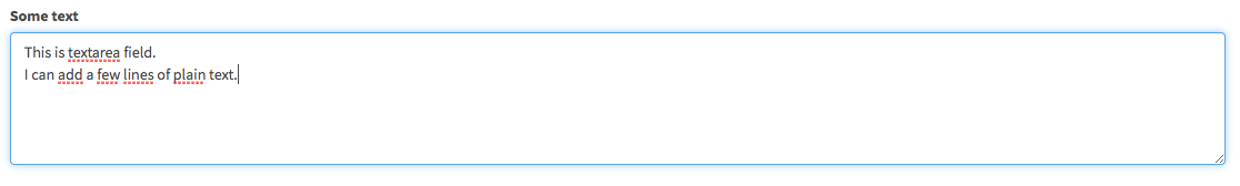
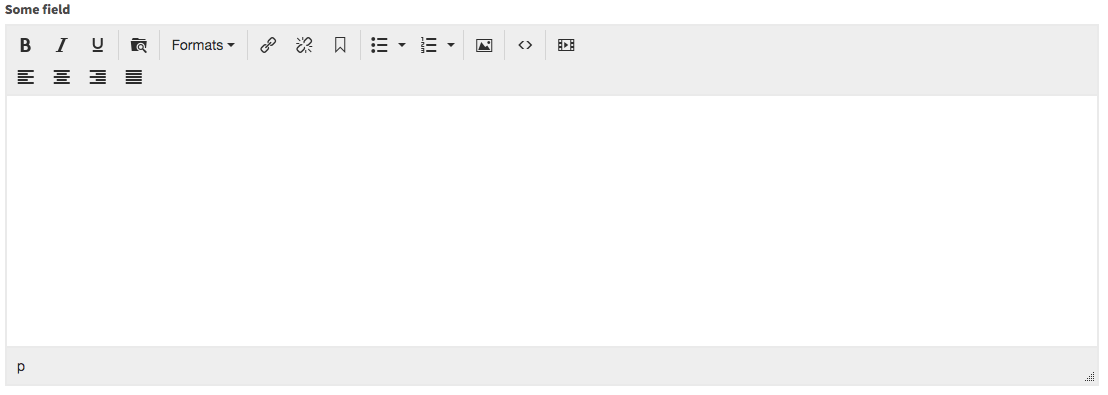
textarea
It is a text-only field and its purpose is multi-line text edit. Remember to use {!! nl2br($components->text) !!} function to return break lines as user can add them via this type of field.
Preview:
JSON configuration example
"some_field": {"order": 1,"type": "textarea","label": "Some field's label here"}
Example of implementation in a section
@if (!empty($components->some_field)){!! nl2br($components->some_field) !!}@endif
select
It is a dropdown list to select one of the available options. It is extremely helpful microcomponent to be used to give Alfred Users the ability to choose some option, setting, variant etc.
Preview:

JSON configuration example
"some_field": {"order": 1,"type": "select","label": "Some field's label here","options": [{"label": "Some option 1 (default)","value": ""},{"label": "Some option 2","value": 2},{"label": "Some option 3","value": 3}]}
Example of implementation in a section
@if (!empty($components->some_field))@if ($components->some_field === 2)things related to option value 2@elseif ($components->some_field === 3)things related to option value 3@endif@elsesome default stuff@endif
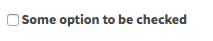
checkbox
It is a checkbox input type field. Helpful if you want to give user an option to enable or disable something.
Preview:
JSON configuration example
"some_field": {"order": 1,"type": "checkbox","label": "Some option to be checked"}
Example of implementation in a section
@if (!empty($components->some_field))stuff related to option when checked@endif
tinymce
It is the WYSIWYG editor that generates HTML code.
Preview:
JSON configuration example
"some_field": {"order": 1,"type": "tinymce","label": "Some field's label here"}
You can also use options property - its value will point to a different than the full TinyMCE configuration (see cmsassets/_ng/services/PageFactory.js). By default, there are 2 options: default (all options, full configuration) and basic (only basic text edit options).
"some_field": {"order": 1,"type": "tinymce","label": "Some field's label here","options": "basic"}
Example of implementation in a section
@if (!empty($components->some_field))<div class="content">{!! $components->some_field !!}</div>@endif
Remember: an overriding HTML element that contains the content coming from TinyMCE within it should always have the content CSS class. It guarantees correct appearance of text/lists/table that can be used by Alfred User in the WYSIWYG editor.
section-modal (for Header and Footer of section)
It is quite a common case that sections have their own header and footer area to edit. Alfred can help with it! In the Header or Footer settings popup, Alfred Users can add a headline, text, buttons and have many more options of customisation.
Preview:

Once the Settings button is clicked, it opens up a popup (for Header or Footer) with several options.
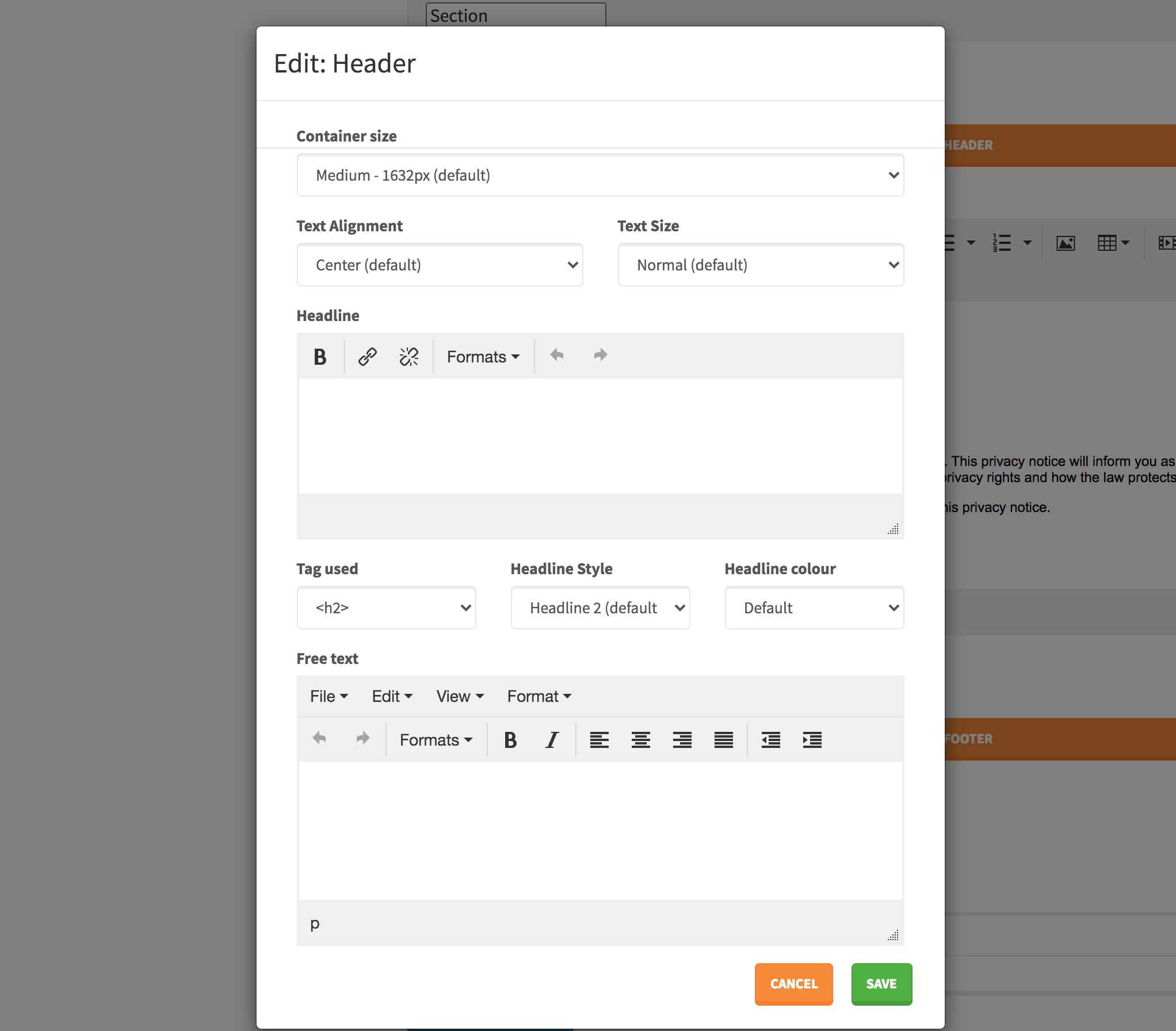
All the options in this popup (see pages-content-insertion-modal.tpl.html) should be edited per project, to match the design needs (at least Container size and Headline colour). Feel free to edit this file and the options. Bear in mind that the values should map the configuration in config/theme.php.
JSON configuration example
"header": {"order": 1,"type": "section-modal","modal_type": "content-insertion","label": "Header"},"footer": {"order": 2,"type": "section-modal","modal_type": "content-insertion","label": "Footer"}
Example of implementation in a section
@include('Website.Sections.columns-sections-partials.header')@include('Website.Sections.columns-sections-partials.footer')
section-modal (for Section Settings)
If you want to give Alfred Users an ability to manage the section settings (in a popup) such as container size, paddings, background, text size etc. - it is a perfect microcomponent to handle it all in one place.
Preview:

Once the Settings button is clicked, it opens up a popup with several options.
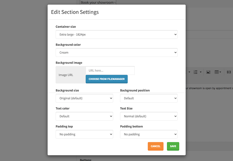
All the options in this popup (see cmsassets/_ng/Pages/pages-section-settings-modal.tpl.html) should be edited per project, to match the design needs (at least Container size, Background color, Text color and padding sizes). Feel free to edit this file and the options. Bear in mind that the values should map the configuration in config/theme.php.
JSON configuration example
"settings": {"order": 1,"type": "section-modal","modal_type": "section-settings","label": "Settings"}
Example of implementation in a section
Pay attention to this example. If Section Settings popup gives an ability to set container size, padding size, font colour etc. - all the options should be working and reflected in the HTML code of the section. Full example below - take a look at all the@include()that populate the HTML code in specfic places.
<sectionclass="section@include('Website.Sections.columns-sections-partials.section-settings')">@include('Website.Sections.columns-sections-partials.background')@include('Website.Sections.columns-sections-partials.overlay')<div class="@include('Website.Sections.columns-sections-partials.container-settings')"><div class="row @include('Website.Sections.columns-sections-partials.row-settings')">Some HTML code...</div></div></section>
It is also possible to disable some of the options if are not needed. Example below:
"settings": {"order": 1,"type": "section-modal","modal_type": "section-settings","settings": {"no_container_sizes": true,"no_vertical_aligned_option": true,"no_padding_sizes": true},"label": "Settings"}
This way the Section Settings popup will not present any options for Container Size, Vertical alignment option or padding sizes.
If you wish to return single CSS classes responsible for some setting (such as padding, text colour), not via the @include() methods - go to Code Snippets page where you can find lots of examples how to get it done.
btns (Buttons)
It is a microcomponent responsible for Buttons. In every section on the design, if you see the buttons, please use this microcomponent as it is the most flexible solution for Alfred Users (they can easily specify button appearance, options such as Google Event Tracking and much more!)
Preview:
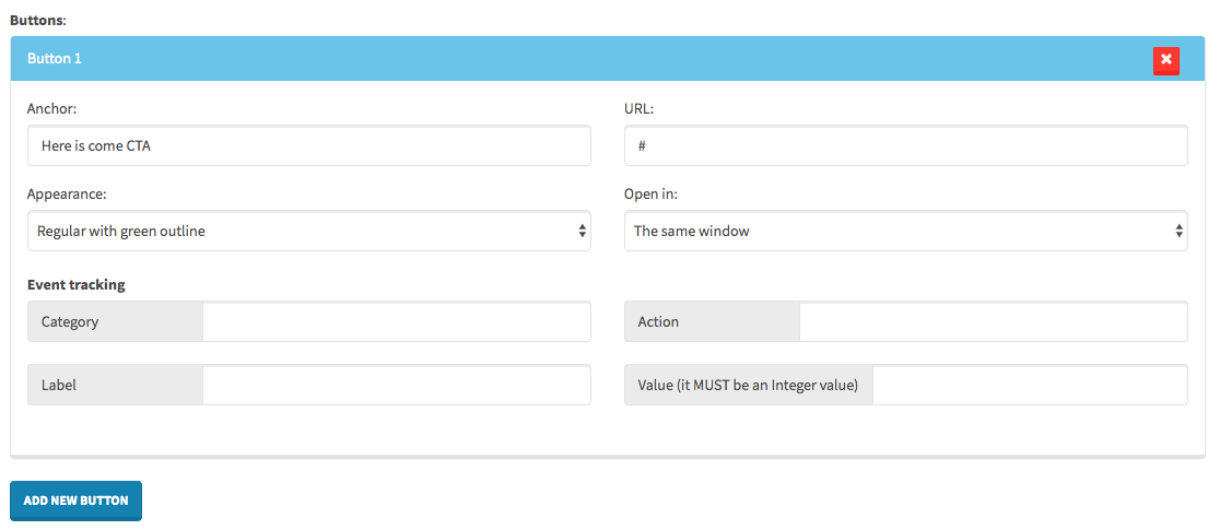
Additional information: Please find HTML file responsible for this microcomponent in the
cmsassets/_ngfolder and feel free to edit the options for the Appearance dropdown list. Remember that the option values should map the CSS classes inconfig/theme.php-->buttonsarray.JSON configuration example
"some_field": {"order": 1,"type": "btns","label": "Buttons"}
Example of implementation in a section
@if (!empty($components->some_field))@foreach($components->some_field as $btn){!! HTML::button($btn) !!}@endforeach@endif
You can also specify additional CSS class names that should be added to each button. See the example below.
@if (!empty($components->some_field))@foreach($components->some_field as $btn){!! HTML::button($btn, 'some-extra-css-class') !!}@endforeach@endif
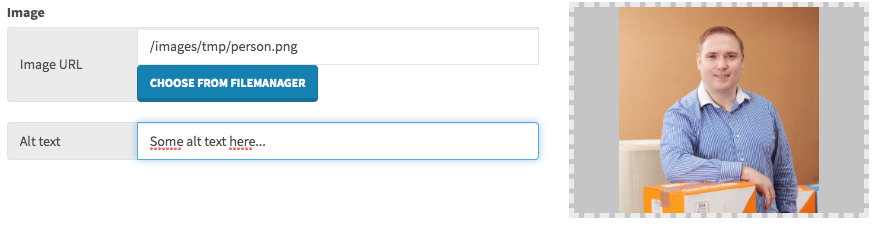
image
It is an image upload field. Thanks to this microcomponent, user is able to provide image URL (manually or via File Manager).
Additionally, as soon as the image URL field is specified by user, there is another field that comes up - Alt text. Please always remember to display value of that field on front page in the section blade template as it is very important functionality for SEO purpose. The Alt Text sits always under the same name as the image value + _alt suffix. Please see the example of usage in a section on the front page to understand it.
Preview:
JSON configuration example
"some_field": {"order": 1,"type": "image","label": "Image"}
Example of implementation in a section
@if (!empty($components->some_field))@php$imageSizes = HTML::getImageSizes($components->some_field);@endphp<imgsrc="{{ $components->some_field }}"alt="{{ !empty($components->some_field_alt) ? $components->some_field_alt : '' }}"@if (!empty($imageSizes[0]) && !empty($imageSizes[1]))width="{{ $imageSizes[0] }}"height="{{ $imageSizes[1] }}"@endif>@endif
Remember: in most cases, in Alfred projects, the image implementation should be done with Imgix integration (go to Imgix section of the documentation) to understand it.
video
It is a video upload field, similiar to the image microcomponent. Alt text field does not come up once video input is specified and “Choose from filemanager” button leads users to file manager popup with only MP4/webm/ogv files filtered.
Preview:

JSON configuration example
"some_field": {"order": 1,"type": "video","label": "Video"}
Example of implementation in a section
@if (!empty($components->some_field))<videoautoplaymutedloop><source src="{{ $components->some_field }}" type="video/mp4"></video>@endif
Bear in mind: in most cases, in Alfred projects, the video should be served via Imgix. Go to Imgix section of the documentation to find out more.
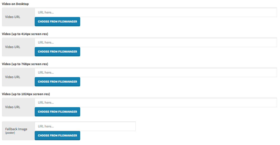
video-responsive-background (responsive video)
It is a very helpful microcomponent for the video backgrounds, quite often met in the web design. It displays a few video inputs to upload a video per specific screen resolution + fallback image (poster).
Preview:
JSON configuration example
"video": {"order": 1,"type": "video-responsive-background","label": "Video Background"}
Example of implementation in a section
The following example does use Imgix implementation!
@if (!empty($components->video_desktop) ||!empty($components->video_414) ||!empty($components->video_768) ||!empty($components->video_1024))<divclass="bg-media bg-media--video"@if (!empty($components->poster))data-static-img="{!! Imgix::getSingleUrl($components->poster, 'w=768') !!}"@endif><videoclass="js-video-src-rwd"autoplaymutedloop@if (!empty($components->video_desktop))data-desktop="{!! Imgix::getSingleUrl($components->video_desktop) !!}"@endif@if (!empty($components->video_414))data-414="{!! Imgix::getSingleUrl($components->video_414) !!}"@endif@if (!empty($components->video_768))data-768="{!! Imgix::getSingleUrl($components->video_768) !!}"@endif@if (!empty($components->video_1024))data-1024="{!! Imgix::getSingleUrl($components->video_1024) !!}"@endif>@if (!empty($components->video_desktop))<source data-src="{!! Imgix::getSingleUrl($components->video_desktop) !!}" type="video/mp4">@endif</video></div>@endif
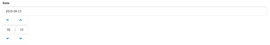
datepicker
If you need to display a date in specific place in a section layout on front page, this microcomponent can be helpful for Alfred Users for easy date selection and for developers to display dates in the date format.
Preview:
JSON configuration example
"some_field": {"order": 1,"type": "datepicker","label": "Date"}
padding
Sometimes there may be a case when you do not want to give all options to be set up in the Section Settings and give Alfred Users just single option such as padding size. Using the padding microcomponent will do the job then!
Preview:

JSON configuration example
"padding_top": {"order": 1,"type": "padding","label": "Top padding"}
Example of implementation in a section
{!! HTML::padding($components, 'padding_top') !!}
- Additional information:
If you want to edit the padding options, go to
cmsassets/_ng/templates/templates.tpl.htmland find this microcomponent in order to set your own padding values. Remember that they should map the options inconfig/theme.php-->paddingsarray.
container-sizes (Container Sizes)
Sometimes there may be a case when you do not want to give all options to be set up in the Section Settings and give Alfred Users only single option such as container size selection. Using the container-sizes microcomponent will do the job then!
Preview:

JSON configuration example
"container_size": {"order": 1,"type": "container-sizes","label": "Container size"}
Example of implementation in a section
{!! HTML::containerSize($components, 'container_size', 'container') !!}
The 3rd argument of this containerSize() method is responsible for returning a default CSS class in case if none of the container size is selected.
- Additional information:
If you want to edit the container sizes, go to
cmsassets/_ng/templates/templates.tpl.htmland find this microcomponent in order to set your own values. Remember that they should map the options inconfig/theme.php-->names -> containerarray andsizes -> container.
bg-colours (Background Colours)
If you want to give Alfred Users an option to select a background color (dropdown list), then microcomponent bg-colours is a perfect match!
Preview:

JSON configuration example
"bg_colour": {"order": 1,"type": "bg-colours","label": "Background Color"}
Example of implementation in a section
{!! HTML::backgroundColour($components, 'bg_colour') !!}
- Additional information:
If you want to edit the background colour options, go to
cmsassets/_ng/templates/templates.tpl.htmland find this microcomponent in order to set your own values. Remember that they should map the options inconfig/theme.php-->colours -> background.
text-colours (Text Colours)
If there is a need in some section that Alfred User should be able to choose a colour of some text in the section, the text-colours microcomponent will be very helpful to meet the requirements.
Preview:

JSON configuration example
"text_colour": {"order": 1,"type": "text-colours","label": "Text Colour"}
Example of implementation in a section
{!! HTML::fontColour($components, 'text_colour') !!}
- Additional information:
If you want to edit the text colour options, go to
cmsassets/_ng/templates/templates.tpl.htmland find this microcomponent in order to set your own values. Remember that they should map the options inconfig/theme.php-->colours -> font.
form-selection (Form)
Almost every website has a contact form in one of the headers or sections. In order to implement it, use the form-selection microcomponent that will allow Alfred User choosing the Alfred Form.
Preview:
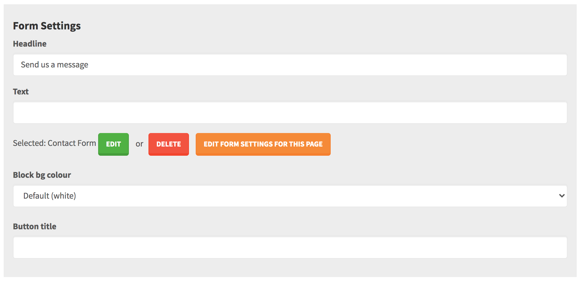
It is a common case that a form might get a different colour variant. Feel free to edit the cmsassets/_ng/directives/FormSelection/templates/form-selection.tpl.html and add/edit the Block bg colour. It is recommended to use the HTML::backgroundColour() method to the CSS class for it (to map a saved background colour id from config/theme.php) - take a look at resources/views/Website/Form-templates/block-bg-colour.blade.php to see how it goes. Of course you can edit this file.
JSON configuration example
"form": {"order": 1,"type": "form-selection","label": "Form"}
Example of implementation in a section
@include('Website.Form-templates.section-form')
include (known as autocompleter)
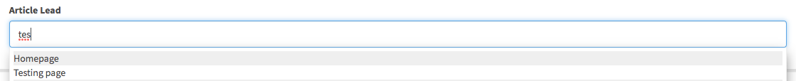
Sometimes in the sections, there may be a need to display a lead of some page (such as article, blog, resource etc.). In order to do that, it needs to be possible to choose a page within the section. That’s why microcomponent include (or include-filter, see next point) can be useful. Thanks to this field, user can type a title of some page and as soon as some page is selected, in the content there is the ID of that page saved. On the front page you are able to handle pulling in the needed data of the page then.
Preview:
JSON configuration example
"some_article": {"order": 1,"type": "include","label": "Article Lead"}
Attention please:
As soon as Alfred User has selected some page via this microcomponent, it saves following data (that is accessible through $components):
+some_article: {+id: 1+title: "Page title"}
The title property should never be used on front page! Its purpose is to display the page title/name only in that microcomponent, in Alfred interface. You should always only rely on the page's id and pull the needed data by this ID (page title, lead etc.)
include-filter (known as autocompleter)
It is exactly the same microcomponent as the include one, however it has very useful option - you can filter the pages visible in the autocompleter list by some module (for example Alfred User will be able to include a page only from Blog module).
Preview:
JSON configuration example
"some_blog": {"order": 1,"type": "include-filter","label": "Blog Lead","search_type": "blog"}
Attention please:
As soon as Alfred User has selected some page via this microcomponent, it saves following data (that is accessible through $components):
+some_blog: {+id: 1+title: "Page title"}
The title property should never be used on front page! Its purpose is to display the page title/name only in that microcomponent, in Alfred interface. You should always only rely on the page's id and pull the needed data by this ID (page title, lead etc.)
custom-component
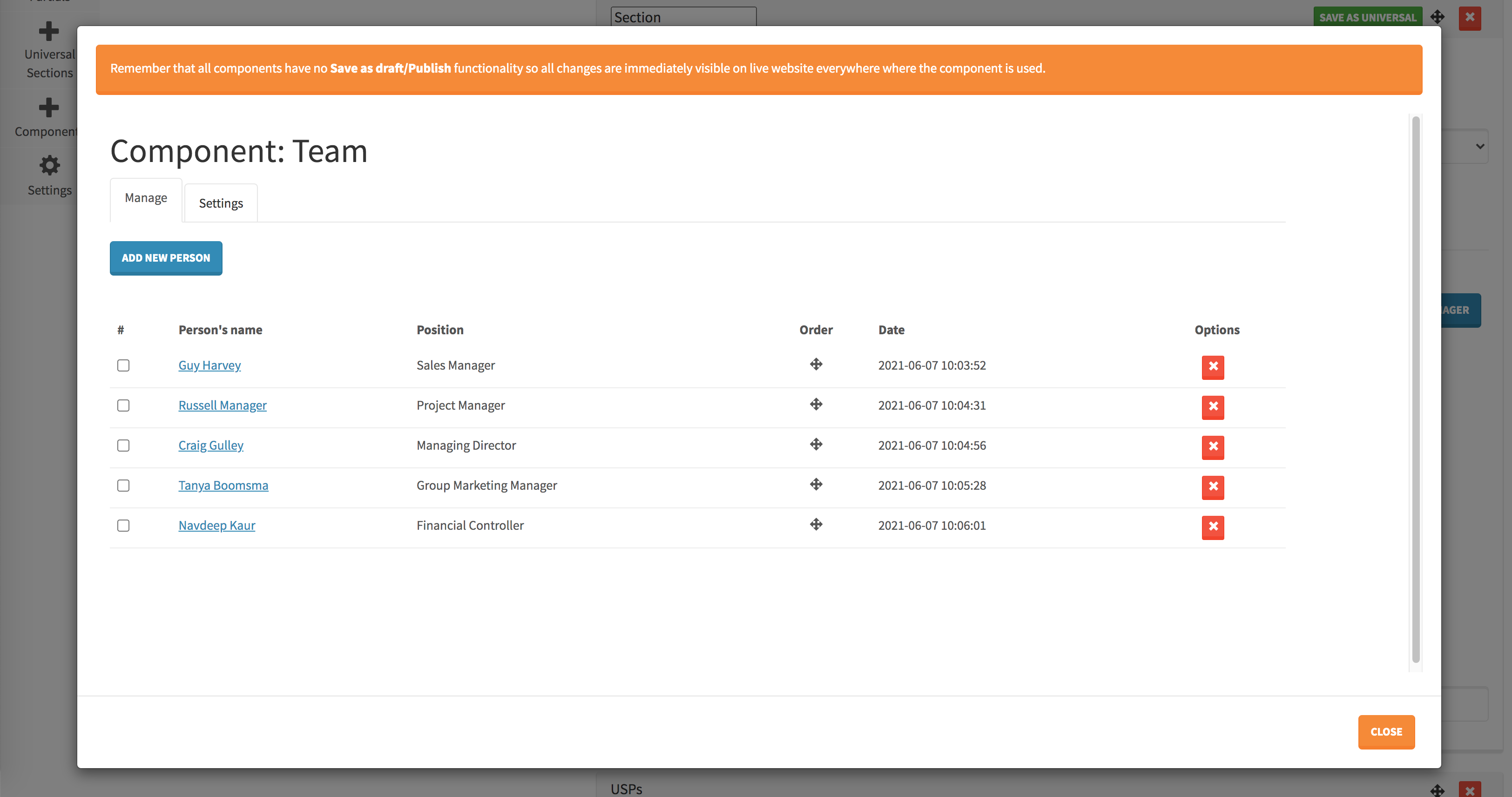
In a section you can attach a Component (please see the section Components what they are and how to customise them). Content/elements in a custom component are being saved in a separate database table.
Preview:
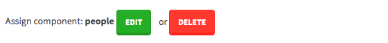
Once the component button is clicked, it opens up a popup to edit it.
JSON configuration example
"people": {"order": 1,"type": "custom-component","label": "Assign component","options": [{"label": "Choose component"},{"label": "People","value": "people"}]}
Example of component implementation (People component example):
@if (!empty($components->people->id)){!! \WebsiteComponent::people($components->people->id,'people-component-template',['sectionId' => $key]) !!}@endif
info
Sometimes you may want to inform Alfred Users about something in the section (some information, important notice etc.) and then you will use the info microcomponent. It is purely to display some text in the section and should not be used in a section template on front page.
Preview:

JSON configuration example
"info": {"order": 1,"type": "info","label": "Important: please use BOLD text in order to make text green on front page."}
Custom microcomponents
Sometimes in the sections there might be some special elements that are impossible or hard to be built using the default microcomponents. The most common case is a section that contains repeating (looped) elements, where you need to give to Alfred Users an ability to add multiple elements.
Feel free to add your custom microcomponents in the cmsassets/_ng/templates/templates.tpl.html and use them in the sections.
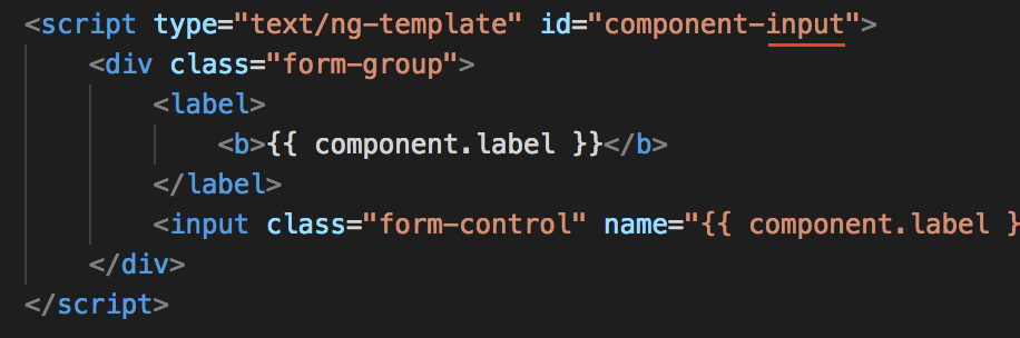
Creating custom microcomponents
If you want to create a custom microcomponent such as tiles, please add the HTML code of the microcomponent to the cmsassets/_ng/templates/templates.tpl.html (the order of all <script> does not matter), as per the example below:
<script type="text/ng-template" id="component-tiles"><div class="form-group"><label><b>{{ component.label }}</b></label>Your custom HTML code of the microcomponent here...</div></script>
Please visit our Alfred Microcomponents Collection repo (https://bitbucket.org/snowflakers/alfred-microcomponents) and use one of them or even customise them matching the project needs.
What kind of knowledge you need to have in order to create custom microcomponents? What foreach loop and HTML is :-). That’s all.