Website Theme
Website Theme is a library of designed & front-end coded elements that have to be reflected in Alfred CMS in order to allow Alfred Users to use them for example in Headers or Sections.
Re-usable front-end theme elements have to be connected to Alfred and their implementation is one of the essential steps to do at the beginning of setting up a project to give Alfred Users flexibility of section/header/other elements customisation and usage.
Website Theme elements
The Website Theme elements that always have to be prepared by front-end developers before implementation in Alfred are:
- buttons
- section padding sizes
- container sizes
- colours and background colours
- headlines
- text/paragraph sizes
- forms and their fields
Bear in mind, that once the theme options are configured in Alfred, in order to return the elements on front page in sections/headers in selected variant/colour/option, you need to know the Microcomponents and how to use them. Page Code Snippets is also useful where you can find real examples of theme options implementation in the blade templates.
Examples of design that shows the website theme elements:
- Headlines and paragraph sizes: https://xd.adobe.com/view/9ced43b3-7be0-4224-b872-d8f57f717d4d-c9be/
- Colours and background colours: https://xd.adobe.com/view/9ced43b3-7be0-4224-b872-d8f57f717d4d-c9be/screen/9cf7927b-56a0-4551-9779-975981d16532/
- Buttons: https://xd.adobe.com/view/9ced43b3-7be0-4224-b872-d8f57f717d4d-c9be/screen/b2ccd204-edd5-4eff-b06c-927911aaf100/
- Forms: https://xd.adobe.com/view/9ced43b3-7be0-4224-b872-d8f57f717d4d-c9be/screen/720132c0-c863-49d0-8dc4-94eecaf9f7ad/
- Container sizes, section padding sizes https://xd.adobe.com/view/9ced43b3-7be0-4224-b872-d8f57f717d4d-c9be/screen/6ff52ff2-fa5c-4899-9002-6a1970d7bdcd/
Front-end developer should code all the elements and an example of the coded elements you can find here: https://haiken.bigpic.dev/theme.html. This kind of theme library should be prepared by front-end developer before any Alfred implementation.
How to get started with Website Theme implementation
Please follow the below steps in order to get the Website Theme implementation done in Alfred.
1. Buttons
Files that you have to edit:
config/theme.phpcmsassets/_ng/directives/templates/buttons.tpl.html
Edit the config/theme.php file and find buttons array where there should be a list of all available button styles.
'buttons' => ['btnStyles' => [0 => 'btn btn--css-class-1',1 => 'btn btn--css-class-2',2 => 'btn btn--css-class-3',],]
Go to the provided HTML code of your project's theme and find the button styles. All the button variants (and their CSS classes) have to have their reflection in this array.
Example
In this example of theme buttons (https://haiken.bigpic.dev/theme.html), there are button variants as below:
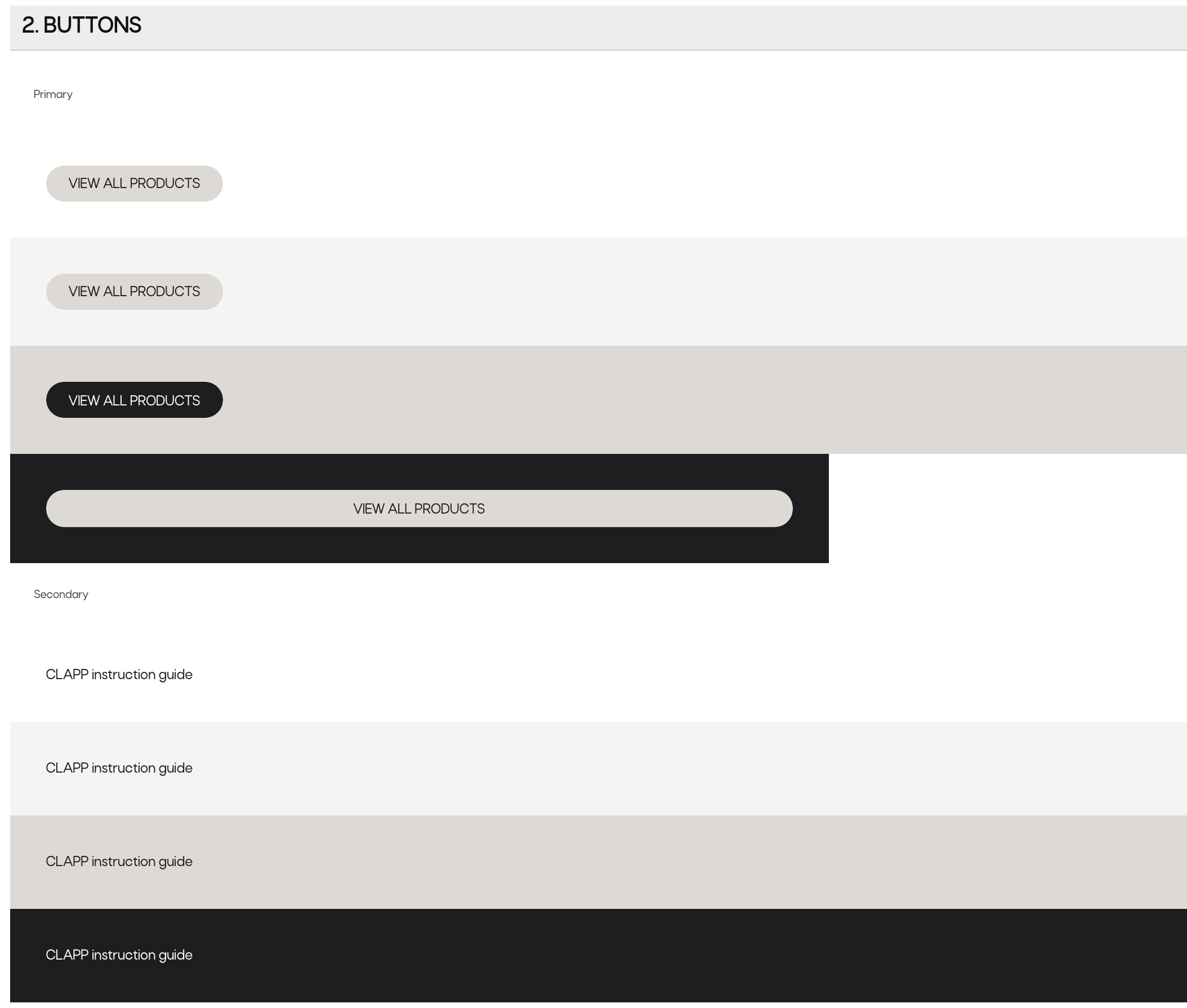
In order to get them implemented, add the button variants' CSS classes in the config/theme.php, looking at the front-end HTML code of them.
See the example below:
'buttons' => ['btnStyles' => [0 => 'btn btn--primary',1 => 'btn btn--primary btn--black',2 => 'btn btn--secondary',3 => 'btn btn--secondary btn--white',],]
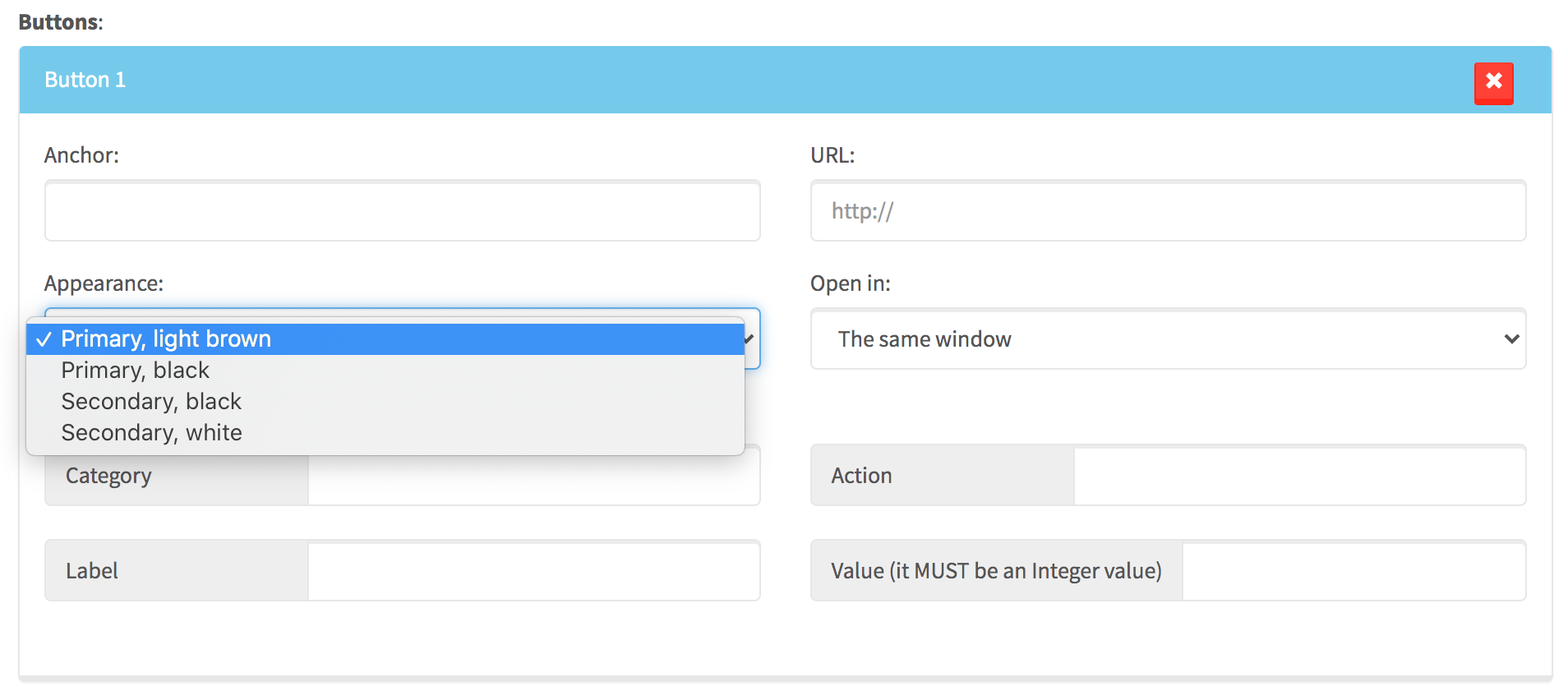
Next step is to make them visible in the Buttons microcomponent.
Go to cmsassets/_ng/directives/templates/buttons.tpl.html and edit the code responsible for displaying the button style list, following the options you have just set up in the config file.
See the example below:
<option value="">Primary, light brown</option><option value="1">Primary, black</option><option value="2">Secondary, black</option><option value="3">Secondary, white</option>
The default button style on this list should always have an empty value (and in theme.php that default button style should be under the 0 array index)! All the other button variants and their values in this <select> should be exactly the same as the index numbers in the config/theme.php.
If you are not sure about the button styles that should be presented in Alfred, consult it with designer and/or front-end developer.
Once this is all done, in Alfred, if you create a header or section that uses the Buttons microcomponent, the button variants should be visible as below:
Please always add some button(s) and test them on the front page in terms of the selected appearance style. Make sure it matches the original design/front-end code on the website.
Sometimes the button's HTML code (because of custom design) requires special HTML changes. If this is the case in your project, just go to button template - resources/views/Website/Templates/button.blade.php - (used on front page of the website) and adjust the code it as you wish.
2. Section padding sizes
Files that you have to edit:
config/theme.phpcmsassets/_ng/Pages/pages-section-settings-modal.tpl.html
Section padding sizes (top and bottom) should be created in the front-end code, using a CSS class naming convention as below:
.section--p-extra-small-top.section--p-large-bottom.section--p-none-bottom- and so on...
If we have a design that requires section padding sizes as below...
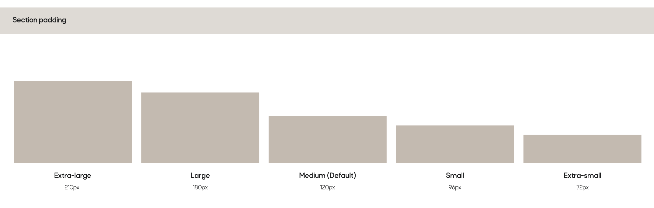
... those options have to exist in Section Settings microcomponent, see an example below:
In order to get them implemented, start from editing the config/theme.php and find the array of padding size list under the paddings array index.
See the example below:
'paddings' => [1 => 'section--p-extra-small-',2 => 'section--p-small-',3 => 'section--p-large-',4 => 'section--p-extra-large-',5 => 'section--p-none-',],
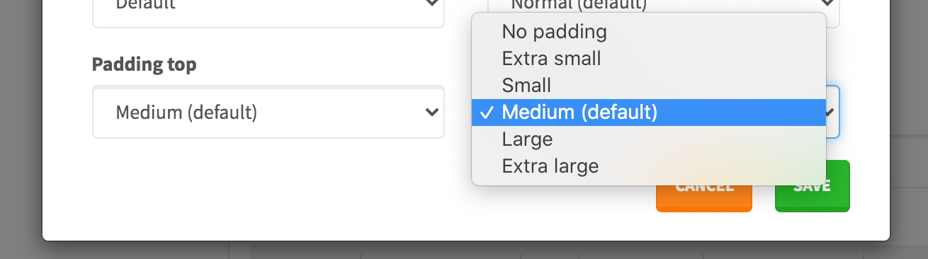
Again, the padding sizes should be selectable in Alfred, in the Section Settings, so please go to cmsassets/_ng/Pages/pages-section-settings-modal.tpl.html and find the Padding top and Padding bottom. Edit the <select> lists and include the correct names from your project's theme and assign the values that come from array index numbers from the config file.
See the example below:
<option value="5">No padding</option><option value="1">Extra small</option><option value="2">Small</option><option value="">Medium (default)</option><option value="3">Large</option><option value="4">Extra large</option>
Remember: the default padding size should get an empty value! This way, on front page, none CSS class will be returned in the section class attribute and the correct front-end sizing should be just properly done by front-end developer in the front-end code. .section should get the default top/bottom padding as per design and it is front-end developer's responsibility to get it done correctly.
Please always select some padding sizes and test them on the front page in terms of the selected option. Make sure it matches the original design/front-end code on the website.
3. Container sizes
Files that you have to edit:
config/theme.phpcmsassets/_ng/Pages/pages-section-settings-modal.tpl.htmlcmsassets/_ng/Pages/pages-content-insertion-modal.tpl.html
Container size (width) should be always possible to be set via Section Settings microcomponent in Alfred.
Before Alfred implementation, the CSS classes responsible for particular container width, should be prepared by front-end developer first. Examples of CSS classes (and the naming convention):
.container.container-xs.container-xl- and so on...
Example of the design requirements:

Those container variants should be selectable in the Section Settings microcomponent, as below:
In order to get them implemented, edit the config/theme.php file and find the container array under the sizes. The front-end CSS classes responsible for containers should be set up in this array. To find out what the CSS classes are - go to the front-end HTML code first.
See the example below:
'sizes' => ['container' => [0 => 'container',1 => 'container-xs',2 => 'container-s',3 => 'container-l',4 => 'container-xl',5 => 'container-xxl',6 => 'container-fluid',],]
The default container size should be under the array index 0.
The container sizes should be selectable in Section Settings microcomponent so in order to make is happen, please go to 2 files:
cmsassets/_ng/Pages/pages-section-settings-modal.tpl.htmlcmsassets/_ng/Pages/pages-content-insertion-modal.tpl.html
In both files, please find the <select> with the container options and edit it so the option values indicate the same array index number from the config file.
See the example below:
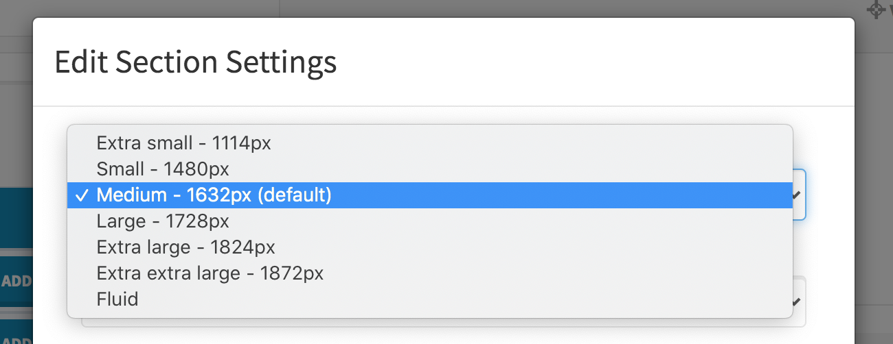
<option value="1">Extra small - 1114px</option><option value="2">Small - 1480px</option><option value="">Medium - 1632px (default)</option><option value="3">Large - 1728px</option><option value="4">Extra large - 1824px</option><option value="5">Extra extra large - 1872px</option><option value="6">Fluid</option>
Please make the options as much clear for Alfred Users as possible - ideally if next to the container size name there is also width in px.
Remember: the default container size should get an empty value! This way, on front page, the value from the 0 array index will be taken (from the config/theme.php).
Please always select some container sizes and test them on the front page in terms of the selected option. Make sure it matches the original design/front-end code on the website.
4. Colours and background colours
Files that you have to edit:
config/theme.phpcmsassets/_ng/Pages/pages-section-settings-modal.tpl.htmlcmsassets/_ng/Pages/pages-content-insertion-modal.tpl.htmlcmsassets/_ng/templates/templates.tpl.htmlcmsassets/_ng/services/PageFactory.js
It should be always possible for Alfred Users to set a background color of any section (or some particular element within it) or headline and text colour.
In order to get the background colour or text colour options implemented in Alfred, go edit the config/theme.php and find the colours array. You should see nested arrays that are self-explanatory. Again - in order to find out about the CSS classes, please look into front-end/HTML code first, find the colour variants (background and text) and edit those arrays. All of them should be created and given for Alfred Users following the project specification.
Example of colour setup in a project:
'colours' => ['font' => [1 => 'color-white',2 => 'color-black',3 => 'color-lightBrown',4 => 'color-paragraphBlack',],'background' => [1 => 'bg-white',2 => 'bg-offWhite',3 => 'bg-cream',4 => 'bg-black']],
Next step is to edit the following files:
cmsassets/_ng/Pages/pages-section-settings-modal.tpl.htmlcmsassets/_ng/Pages/pages-content-insertion-modal.tpl.htmlcmsassets/_ng/templates/templates.tpl.html(find microcomponets such as bg-colours and text-colours)
Find all the <select> lists where you can find Background colour, Headline colour or Text colour. Fill out the option values that should point to the array index numbers from the config file.
Example:
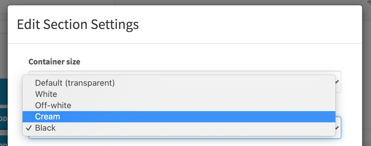
<option value="">Default</option><option value="1">White</option><option value="2">Black</option><option value="3">Light brown</option><option value="4">Paragraph black</option>
Please remember that the default option (no colour selected) should be just empty.
As an example, in the Section Settings, the dropdown will look as below:
Please remember about editing all the possible places (see the mentioned HTML files above) where Alfred User can select some colour.
Please always select some colour options and test them on the front page in terms of the selected option. Make sure it matches the original design/front-end code on the website.
Tinymce (important!)
The text colour options should be possible to be selected also via WYSIWYG editor. Please remember to apply project's CSS classes responsible for text colours in the cmsassets/_ng/services/PageFactory.js - find availableTinymceOptions where there are all available TinyMCE instances and in the style_formats you will see the Text colour options that should be edited by you, to match your project CSS options and their class names. Run grunt prod:cms from cms-backend/ folder to compile the Alfred JS files after the changes.
5. Headlines
Files that you have to edit:
config/theme.phpcmsassets/_ng/Pages/pages-content-insertion-modal.tpl.htmlcmsassets/_ng/services/PageFactory.js
Website front-end layer that has to be integrated with Alfred should always present headline types (sizes) and these should be selectable in Alfred.
The front-end CSS classes for the headlines should follow the naming convention as below:
.headline-1.headline-2.headline-3- and so on...
To get the headline types (sizes) implemented in Alfred, start from looking into the front-end code where all the headline variants should be presented and see what CSS classes are represented by them.
Next step is to follow the CSS classes and apply them into the config/theme.php, in the headline array under sizes set.
See the example of headline sizes configured:
'sizes' => ['headline' => [0 => '',1 => 'headline-2',2 => 'headline-3'],]
Next step is to find <select> with headline size options in Alfred microcomponents such as cmsassets/_ng/Pages/pages-content-insertion-modal.tpl.html and apply the specific variants.
Example below:
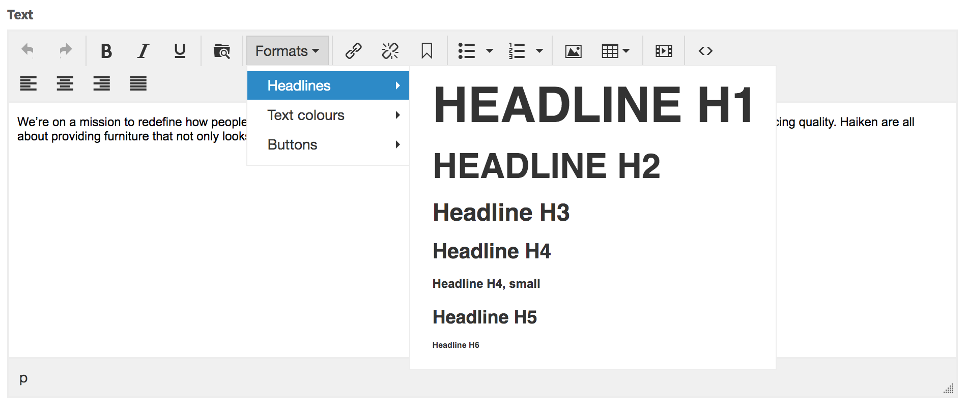
<option value="">Headline 1 (default)</option><option value="1">Headline 2</option><option value="2">Headline 3</option>
The option values should match the array index numbers from the config file.
Tinymce (important!)
The headline type options should be possible to be selected also via WYSIWYG editor. Please remember to apply project's CSS classes responsible for headlines in the cmsassets/_ng/services/PageFactory.js - find availableTinymceOptions where there are all available TinyMCE instances and in the style_formats you will see the Headlines options that should be edited by you, to match your project CSS options and their class names. Run grunt prod:cms from cms-backend/ folder to compile the Alfred JS files after the changes.
6. Text/paragraph sizes
Files that you have to edit:
config/theme.phpcmsassets/_ng/Pages/pages-content-insertion-modal.tpl.htmlcmsassets/_ng/Pages/pages-section-settings-modal.tpl.html
In Section Settings and Header/Footer microcomponents it is possible to choose the text/font size. Different content font sizes (within the scoped .content CSS class) should be prepared by front-end developer in the Website Theme first.
The front-end CSS classes for the text sizes should follow the naming convention as below:
.content__small-text.content__large-text- and so on...
To get the text sizes implemented in Alfred, start from looking into the front-end code where all the content size variants should be presented and see what CSS classes are represented by them.
Next step is to follow the CSS classes and apply them into the config/theme.php, in the font array under sizes set. Please keep the first array element empty as it represents the default font size (this way no CSS class will be returned on front page).
See the example of font sizes configured:
'sizes' => ['font' => [0 => '',1 => 'content__small-text',2 => 'content__large-text',],]
Next step is to find <select> with font size options in Alfred microcomponents such as cmsassets/_ng/Pages/pages-content-insertion-modal.tpl.html and apply the specific variants.
Example below:
<option value="1">Small</option><option value="">Normal (default)</option><option value="2">Large</option>
The same, please apply to pages-section-settings-modal.tpl.html where the Text size dropdown is.
7. Forms and their fields
All the contact forms in Alfred can be created via Forms module. Several options in the module such as creating the fields, setting up a layout of them (100% or 50%/50% columns) cause a need of preparing the front-end code dictated by Alfred Forms HTML. Please keep the front-end code of Alfred Forms templates unchanged (in resources/views/Website/Alfred-Form-Builder/**/*.php). If custom design requires some changes, please discuss it with front-end developer and try to make any custom apperance only via CSS.
If there is no chance to get it done this way, feel free to edit the form templates (resources/views/Website/Alfred-Form-Builder/**/*.php), however after all the changes please make sure it all works fine.
Last steps
CSS styles for TinyMCE editor
Colours, headlines, lists etc. in TinyMCE need to have some styling in order to display them correctly in the editor. Front-end developer should prepare & copy the CSS code needed only for them in the resources/cmsassets/_scss/tinymce.scss. Do not worry about font face (can be default Arial), ideally matched font size etc. - editor should only match the real front page design as much as possible but it never will be the same look & feel.
In order to prepare the CSS code in the quickest way, get the contents of frontend/dist/styles/main.css, beautify it and copy only the CSS parts responsible for the Theme elements. Paste them into the resources/cmsassets/_scss/tinymce.scss file.
Once this is done, please run grunt prod:cms from the cms-backend/ folder in order to compile the files. From now, the TinyMCE editor will be displaying the styles within it visually correctly for Alfred Users.
config/seo.php
Settings from that file are being used across <head> tags on the website. Please set the company name as a minimum. It is always good to set the Twitter username too.
All the other indexes can be kept untouched because the values are related to frontend.